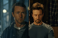
 As a regular follower of Stu Maschwitz's ProLost blog (you may remember Stu as the author of our DVA101 textbook The DV Rebel's Guide), I've noticed that Stu seems a tad obsessed with color correction. And if you've seen my feature The Falls you know it's a subject of some fascination for me as well.
Stu's most recent color correction post "Memory Colors" got me looking back through some of his earlier posts on the subject and it looks like this exploration of the how the human brain processes color is an extension of his earlier examinations of how Hollywood's blockbuster film all seem to be utilizing a color correction scheme that places great emphasis on skin tones.
From October 2007 - "Hue are you?" looks at the fact that all human skin tones, regardless of ethnicity, fall onto the same axis of teh vectorscope and therefore are a lot more homogeneous than we realize.
From March 2008 - "Save Our Skins" takes that a step further and looks at the Hollywood color correction trend of keeping people "porange" (pinkish-orange), regardless of the overall "look" of the film.
From June 2009 - "Got Me a Side Job" talks about Stu's gig working with Red Giant software on their Magic Bullet product line. But most importantly, in the included video tutorial Stu walks us through how to recreate the looks of several Hollywood blockbusters using said software. But even without Stu's fancy plugins, his logic and methodology can be adapted for use with whatever color correction filters you have on hand. Worth a watch!
And now from February 2010 - "Memory Colors" further explores the topic and how human memory affects our perception of not just skin tones, but everything from cabs to coffee beans.
One of the coolest tips I've picked up from Stu - this free tool from Adobe called "Kuler" which can be used to very quickly develop a color scheme for your designs, artwork, color correction, whatever. Be sure to bookmark it!

No comments:
Post a Comment